Book Graphics and Layout: Lead From The Future
Along with my colleague, I designed the graphics and layout for “Lead From The Future: How to Turn Visionary Thinking Into Breakthrough Growth.” Published by Harvard Business Press, Lead From The Future lays out a new and innovative approach to developing and executing the visionary ideas that drive breakthrough growth. My colleague and I worked closely with the author and the publishers to develop a modern graphic language for the book that eschewed the style of traditional business books in favor of something more thoughtful and engaging.
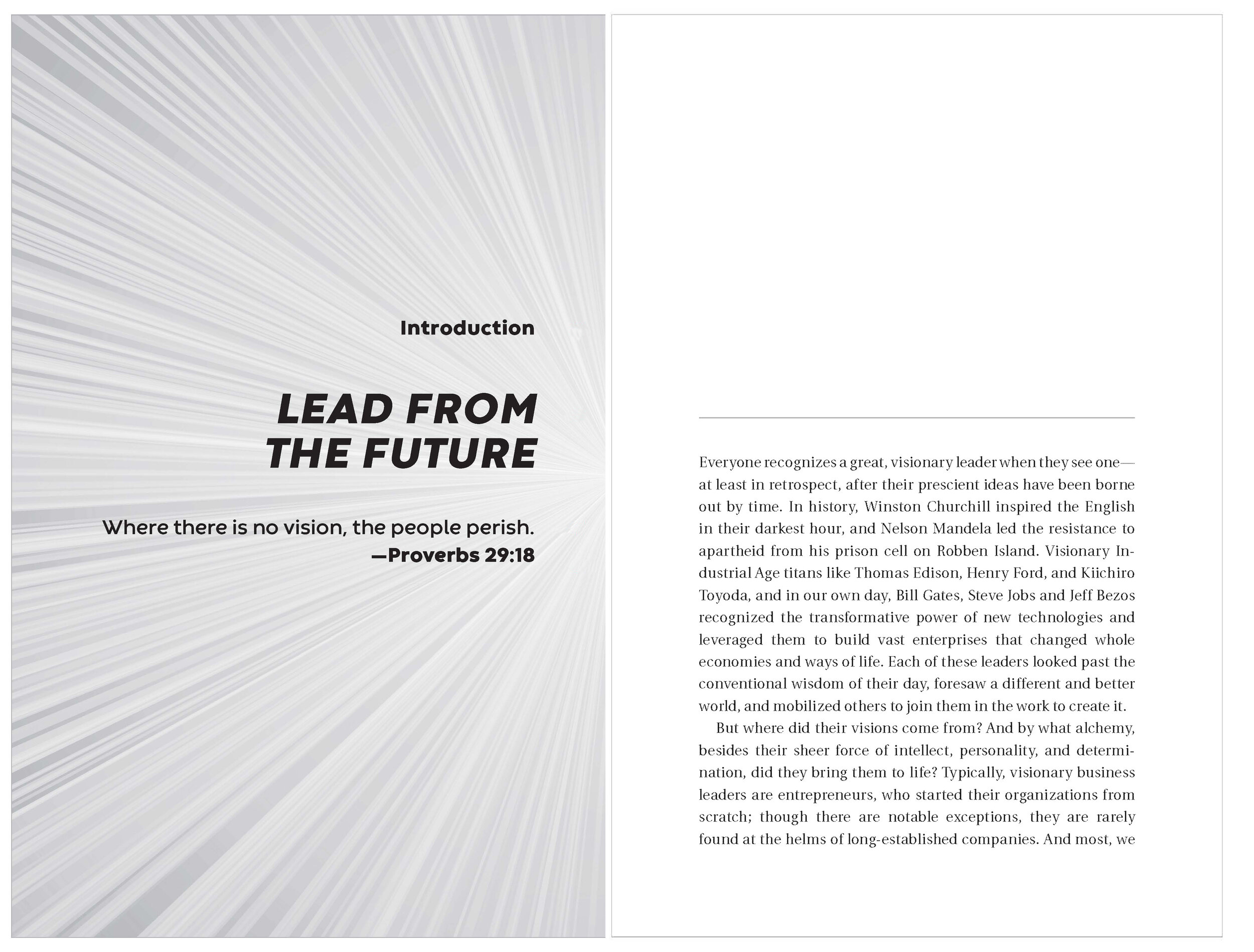
Typical Chapter Spread
The cover of the book, designed prior to our engagement, is bold and forward-looking. We mirrored the starburst and bold text from the cover in to the chapter and section spreads.
Typical Side Bar
The page on the right shows the design for a typical side bar. The bold, sans-serif header differentiates the side bar from the body of text and subtle gray lines create more distinction. Call out boxes have a gray background, so we did away with a gray background for the side bar to create a hierarchy of elements.
Main Process Graphic
This is the most important graphic in the book, and appears many times throughout as a guide to the section of the book. The graphic depicts the main premise of the book and was designed to be more engaging and playful than typical business book graphics. The astronaut’s position in the graphic signals to the reader what phase is being discussed.
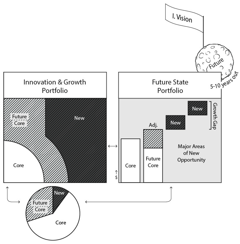
Example Charts
Charts are clean and simple and set apart from the body of the book with light gray backgrounds. Because the book is printed in black and white, we used simple hatching to create more visual distinction than simple shading allows for.


