Interactive Strategy Report
I completely redesigned our client strategy report into an online, interactive website that is easier to distribute and digest. The graphical language and the way we present information was streamlined, making the information more easily navigable and digestible. Access to supporting research and external resources are linked throughout the report.
Report Landing Page
The landing page shows the organization of the entire report on one page, orienting the user to the organization and allowing them to view the report sequentially or select the section most relevant to them. Arguably the most important/popular sections, the Executive Summary and the Opportunities, are accessed via buttons in the header and navigation bar. There is an animated icon directing users to scroll down the page for more content.
Process Sketches
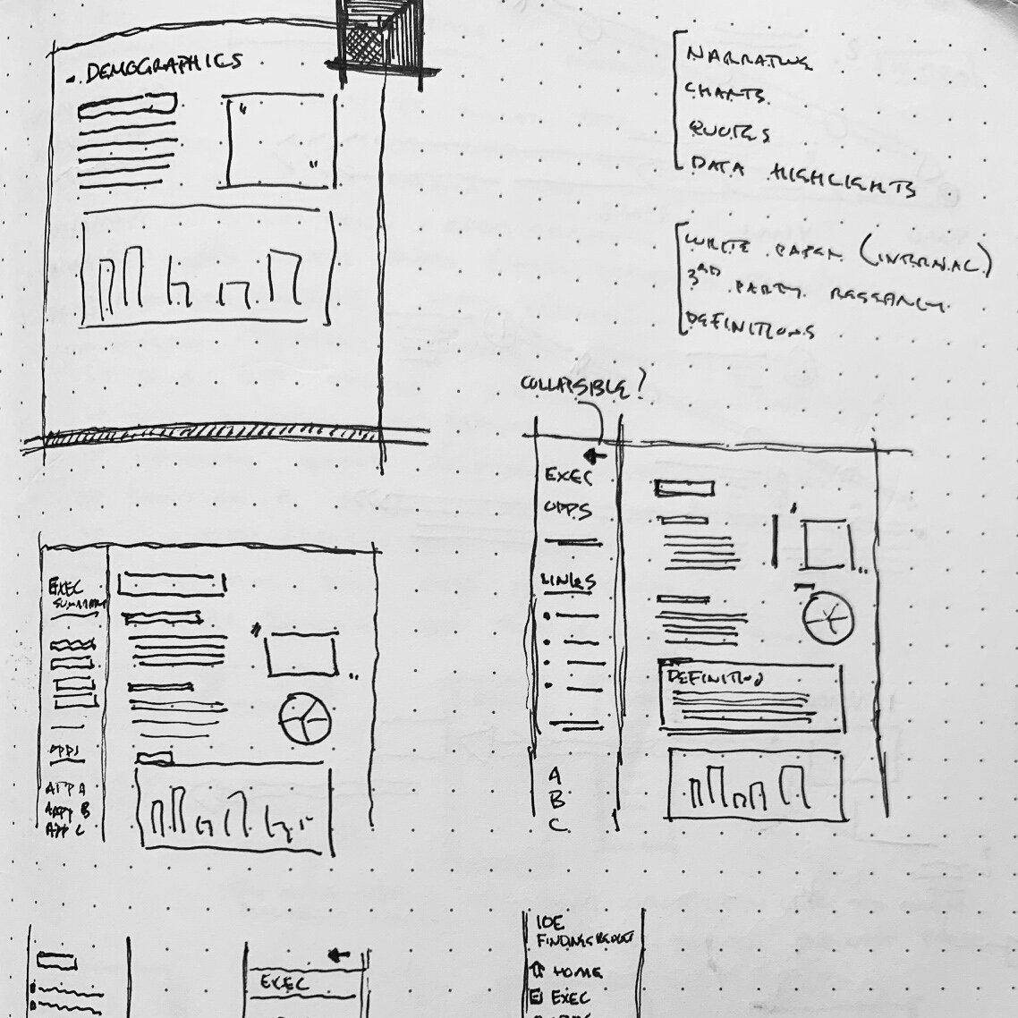
Early process sketches exploring left-hand navigation panel. This layout became too cumbersome and busy. As a result, I decided to introduce the concept of collapsible buckets for each section.
Section showing blue drop down for additional definitions
Interactive charts allow users to explore different breakdowns of the data side-by-side.
In-section opportunities linked to relevant sections above
Opportunities page describes specific opportunities and how they tie into the client’s strategic objectives. These opportunities are linked to the relevant section of the report so the reader can re-visit the finding(s) that led to this opportunity.
Internal Links Tie The Report Together
Issues that are discussed in the body of the report are linked to their associated opportunity at the end of the section (L). The opportunities page (R) has linked opportunities and discusses how the opportunities relate to the client’s strategic priorities laid out an the beginning of the engagement.


